Nonprofit website design that makes your cause clear and supported
Nonprofit website design that tells your story with care and turns visitors into donors, members and volunteers. Clear donation journeys, fast mobile pages and tracking that shows which channels and pages bring support.
- Experience with charities
- Donation journeys that convert
- Tracked donations and sign-ups
- Storytelling
- Told with care and respect
- Donations
- A clear path to giving
- Access
- Accessible and mobile-first
- Tracking
- See what drives donations
Why many nonprofit websites fail to explain the cause
The cause gets buried
Constitution, board members and history sit at the top, while the people and projects are far below. First-time visitors cannot tell within seconds what the organisation stands for and why support matters.
Giving is awkward
Often there is just a bank account number in the legal notice or a link to an external platform. Without a clear path and an explanation of how money is used, willingness to help goes unused.
Nobody knows what works
Whether donations come from social media, Google or a press article stays a mystery. Without tracking, the organisation invests time and money in channels without knowing which ones actually bring supporters.
Nonprofit websites we have built
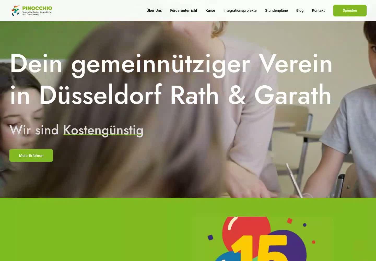
For Perspektive Förderverein we told a sensitive story around autism, ADHD and mental health crises through film, warm colours and dedicated project pages, closely linked to clear donation options. For Pinocchio e.V. the website brings education, movement and community together in clear course categories, with locations, contact routes and easy-to-find ways to give.
Perspektive Förderverein
A sensitive cause. A strong digital presence.
What a strong nonprofit website needs
A clear first impression
A personal opening with imagery or film shows straight away who you support and what your organisation actually does.
Dedicated project pages
Every focus area and programme gets its own well-structured section, so families, beneficiaries and supporters find what they need.
A guided donation page
Donation packages with clear descriptions plus a custom amount make giving easy. Transparency on how funds are used builds trust.
Volunteer and member sign-up
Dedicated pages for volunteering and membership with short forms. People see which roles exist and how to get started.
Accessible and fast
Strong contrast, plain language and fast mobile pages. Anyone opening your site on a phone can reach the donation form without obstacles.
Campaign pages and tracking
Dedicated landing pages for appeals and ads, plus GA4 and Google Ads conversion tracking. You see which channel brings donations and members.
A nonprofit website has several jobs at once. It explains your cause, guides the people you serve, convinces funders and recruits people who want to help. In the end, what counts is the result: donations, new members, volunteers and enquiries from families. Good nonprofit website design therefore starts not with colours and fonts but with three questions: who visits, what should they understand, and what is their next step? This guide covers what matters for charities, foundations and associations, drawing on our work for Perspektive Förderverein and Pinocchio e.V.
01Nonprofit website design starts with your cause
Visitors decide within seconds whether to stay. Your homepage should not open with the constitution or a welcome note from the board, but with what your organisation does for people. One sentence that states your purpose, an image or short film showing real situations and a visible route to your programmes is often enough. On the Pinocchio e.V. website, a cinematic introduction leads straight into the course categories. Families immediately see what is on offer, where it takes place and how to get in touch. Information about the association remains available without getting in the way.
02Charity website design: storytelling with respect
Many charities work on topics that affect people personally: illness, disability, crisis, poverty. Good charity website design tells these stories without pity imagery or drama. It shows people as active participants, uses calm colours and relies on clear, respectful language. That is exactly what we did for Perspektive Förderverein. Autism, ADHD and mental health crises each have their own clearly organised area. An interactive module reveals purpose, process and transparency one step at a time instead of everything at once, and frequently asked questions expand right on the page. Visitors understand what they are supporting before they are asked to give.
03Building a donation page that people complete
A good donation page answers three questions: what is the money used for, how much makes sense, and how easy is it? Donation packages with concrete descriptions help people decide, while a custom amount leaves room for every budget. The donation page should never stand alone. On the Perspektive Förderverein website, donation options, FAQs and contact details connect directly with project information. Trust matters too: charitable status, a named contact and a short note on how funds are used belong in plain view, not hidden in the footer.
04Websites for associations and foundations: recruiting members and volunteers
Money is only one kind of support. Many organisations mostly need people: new members, event helpers, mentors, coaches. A website for associations should therefore include dedicated membership and volunteering pages that describe the actual roles, the time commitment and a short sign-up form. Foundation websites often put funding programmes, application steps and reports first. Either way, every audience deserves its own clear entry point, so supporters, applicants and newcomers do not have to search the same page for different things.
05Accessibility, speed and tracking: more support from every visit
Every obstacle costs you supporters. Sufficient contrast, readable font sizes, alt text, keyboard navigation and plain language make sure everyone can reach your content and complete the donation journey. Fast loading on phones is essential, because many donations happen spontaneously on the move. Tracking matters just as much: with GA4 and properly configured conversions you see which pages, appeals and channels trigger donations, membership applications and volunteer sign-ups. That lets you put scarce time and money where they bring the most support. Your team can update events and news on the side in a simple content system.
06Looking ahead: campaign pages, search and Google Ad Grants
A clean technical foundation helps search engines and AI assistants understand your content, and clear pages for each programme and location help people find you for specific searches. Many nonprofits may also be interested in Google Ad Grants, a programme through which Google provides advertising budget to eligible organisations. Eligibility is decided by Google alone. A well-structured website with clear landing pages is a solid foundation if you decide to explore that route later.
How your nonprofit website comes together
- 01
Cause and audiences
We talk through your purpose, projects and the people you want to reach. From that we build a page structure with clear paths for beneficiaries, donors and volunteers.
- 02
Design and copy
We develop imagery and copy that tell your story respectfully and clearly. You review and approve every step before we build.
- 03
Build with a donation journey
We build an accessible, fast, mobile-ready website including a donation page and forms for membership and volunteering. Everything is tested across devices.
- 04
Growth after launch
We track which pages and channels bring donations, members and volunteers, and optimise copy, donation journeys and forms based on that data. If you wish, we support appeals and campaigns with dedicated landing pages.
FAQ: nonprofit website design
It depends on scope and features, such as the number of project pages, a donation page or multiple languages. A single page starts in the low four figures, larger websites are above that. After the first call you receive a fixed-price quote.
Single pages take two to three weeks, complete organisation websites four to eight weeks. The schedule is fixed before we start and allows for the fact that board approvals sometimes take a little longer.
Through a structure that leads from your cause straight to the next step: donation packages, a custom amount and short forms for membership and volunteering. Every project page has a clear call to support. After launch we measure what works and optimise from there.
Yes. We design a donation page with donation packages and a custom amount and integrate a suitable payment option. Conversion tracking shows which channels lead to donations. We work out the right solution together in the first call.
With restraint and respect. We do not portray people as objects of pity but explain clearly what your organisation achieves. We agree imagery and copy closely with you, as we did for Perspektive Förderverein.
We build the website with clear landing pages that campaigns could use. Whether an organisation is accepted for Google Ad Grants is decided by Google alone. We are happy to discuss whether this route could make sense for you.
Tell us about your organisation
Briefly describe your cause and your goals for donations, members or volunteers. We will reply within 24 hours with an initial assessment.
Or email us directly: hello@btechnology.de